What's new

The New Look of Tabac

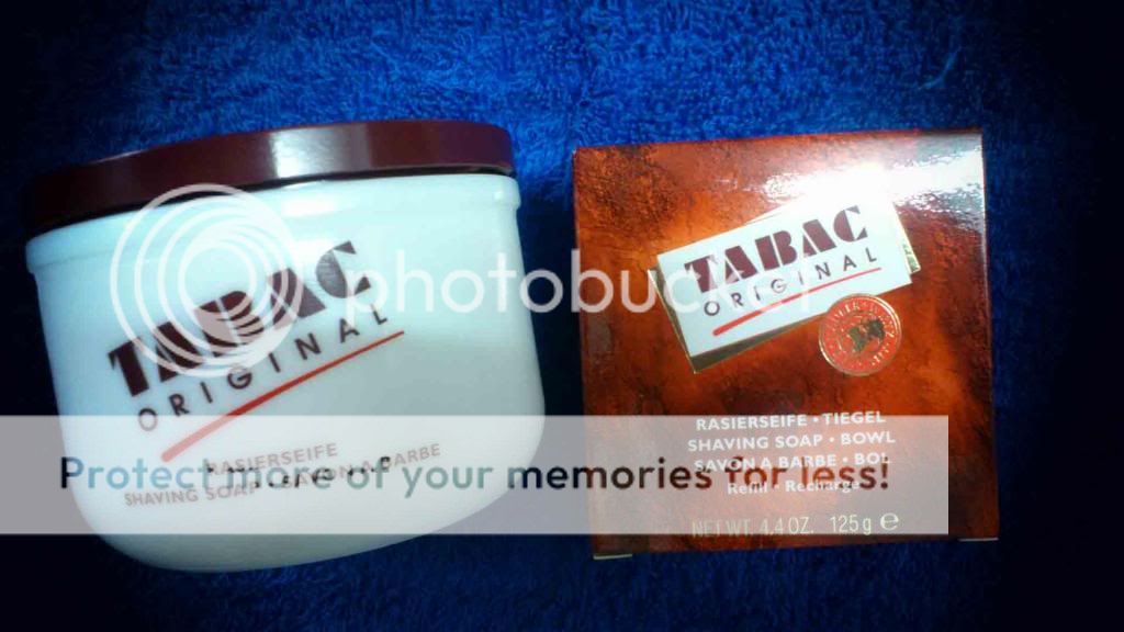
I just took delivery of some Tabac. It's been quite a while since I've had it around. I was surprised to see a new design on the bowl. The colors are also a little different. It looks more updated. I like it. The scent is exactly the same as I remember. It's on deck for tomorrow's shave. I'm glad they updated the logo. The old one reminded me too much of the early 80's for some reason.

$P1030241.jpg
 
The old look did look 80's, and I kind of like the new look; although I won't be selling my jar to update it.
 
Dropped the angled lettering and the underline.

As long as the product formulation doesn't change.

I would think the name itself "Tabac" is more out of date. It doesn't smell like tobacco for starters. I don't think it masks the smell of tobacco either.

Like the product though.

Maybe call it "Cabat" instead?
 
New look, same great shave. I know there was some talk about the ingredients list on the package being a little different. No one seemed sure if it was a different formula or just new EU requirements. Whichever it is, the performance is the same as always.
 
I prefer the old (slanted) logo, but the new one isn't bad. Is it just the soap bowl that has changed design, or are the other products (cream, ASL, EdC, EdT, etc.) getting a face-lift as well?

I need refills on just about everything in my Tabac line-up. I hope that when I place my order, I will get matching logos across the line, and not a combination of old and new.

You know what would really be a big improvement to the shave bowl? If they made it so that the lid would screw on and provide a better seal for traveling, and so that the soap doesn't dry out so quickly between shaves, or when you put it away for the season.
 
at least they kept the ceramic bowls and lid. I bet that is costly when everyone else has gone to cheapy metal containers.

long live tabac.
 
My dad used to have some Tabac cologne when I was growing up, that was the only place I had ever seen any Tabac product before I started wet-shaving and joined B&B. I kind of like the name and the old logo, even if it does look like the 80s. Some of the best times in my life were in the 80s. Haha.
 
The new jar looks good. Someday, I'll get clumsy and break my old one and I won't be as upset as I would be if the new jar looked lousy.

Until then, I'll be happy with my old classic jar.
 
I like the new design! I won't be buying the new jar, though. In fact, I don't see myself using the old jar again, so it will be heading to BST soon.
 
Top Bottom