What's new

Quick Comparison of Three Noodlers' Blues

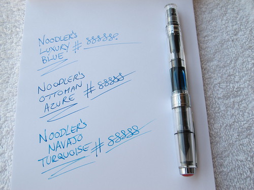
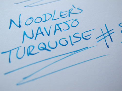
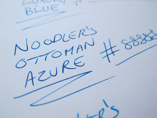
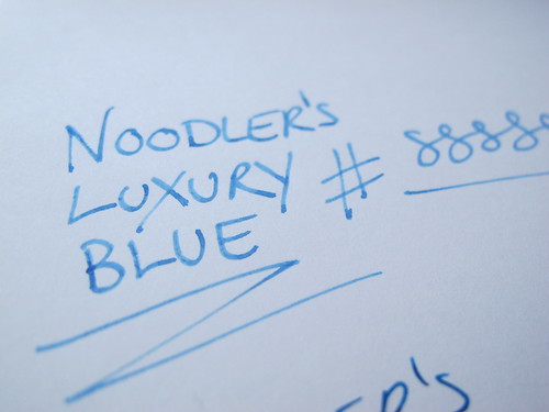
This is just a quick comparison of three Noodlers' Blues which I recently received samples of. They include Navajo Turquoise, Luxury Blue and Ottoman Azure. Of the three, I was most impressed with the Ottoman Azure which is currently loaded in my TWSBI 530 and got plenty of use today at the office. The Azure, to me, falls right in between turquoise and blue-black and that was what I was looking for in a "medium blue." The Noodler's Blue and Blue Eel were also nice and very similar to the Azure, but I found the Blue too dry and the Blue Eel too wet. The Azure was just right. I was also very impressed with Noodler's Navy.

proxy.php

proxy.php

proxy.php

proxy.php
 
Thank you. The TWISBI is a great pen. One thing I notice about the TWSBI is that I have never had an ink misbehave in it like I have in other pens. I think I'm going to dedicate my TWSBI to the Ottoman ink exclusively. They seem to go together well.

This was written on a Rhodia No. 16 pad.
 
Yeah, I noticed how the ink was "misbehaving" and was wondering what kind of paper you were using. Looks like fountain pens & inks have a lot in common with razors & razor blade combinations.

What do you mean by misbehaving? I'm not seeing anything wrong.
 

Doc4

Stumpy in cold weather
Staff member

I must say I am underwhelmed by the luxury blue. :huh: For an ink that is (IIRC) three times as expensive (same price for a 1-oz bottle instead of 3-oz) I'm suprised that it's the one I'd be least likely to buy.

Maybe I just don't "get it" as to what Noodler's was going for with that colour. :blink:
 
:oops:, my bad. I totally misread Fbones24's reply. Sleep depravity and long hours at the job aren't doing this old man any favors.
 
I have a bottle of Ottoman Azzure that will be here tomorrow, and I think I'm going to load it into my TWSBI 530...we'll be pen pals! :lol:
 
OA is a great color. I just wish it withstood water better.

Lux blue and hunter green are two of the worst ink purchases I have made.
 
I must say I am underwhelmed by the luxury blue. :huh: For an ink that is (IIRC) three times as expensive (same price for a 1-oz bottle instead of 3-oz) I'm suprised that it's the one I'd be least likely to buy.

Maybe I just don't "get it" as to what Noodler's was going for with that colour. :blink:

Looks a lot like Mont Blanc Turquoise. Actually a nice colour but pretty light and won't get as much use.
 
Top Bottom