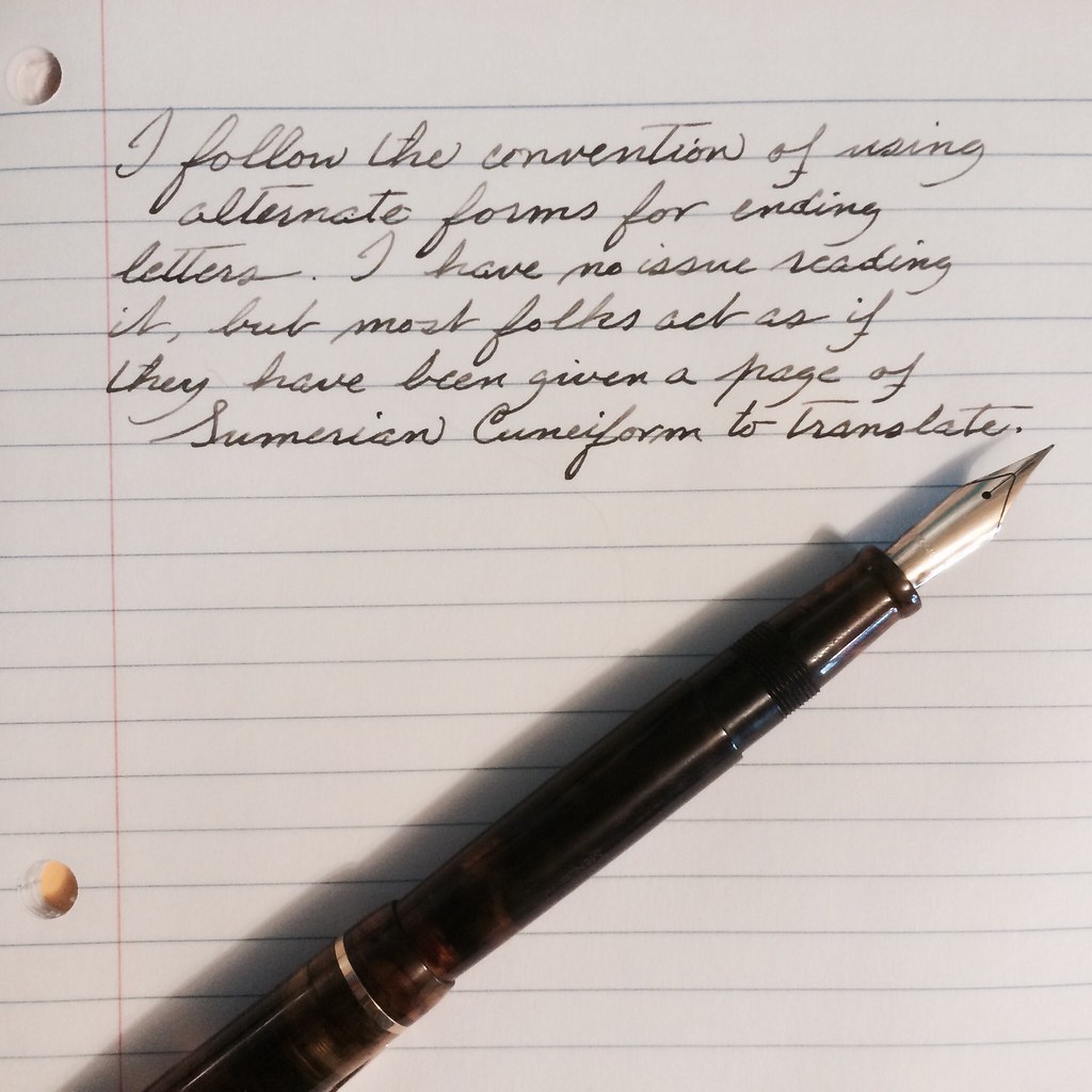
I have been wanting to find a website that would have a comprehensive listing of different scripts for letters & numbers. The best I seem to be able to find is FONT sites for computers.
I am hoping that the great members of the NIB would indulge me with a pic of your letters - both cursive and print. I would like to find something that I want to work on and thought that the collective penmanship knowledge here could help out. If you have a website that you used to mimic your letters, please feel free to post that as well.
I figure this picture view of different types would also be helpful to all the newbies, like me, to the NIB area - particularly when they are wanting to improve their penmanship.
So B&B, let's see some examples of your letters


")