What's new

Improving Penmanship: Printing, Cursive, Both?

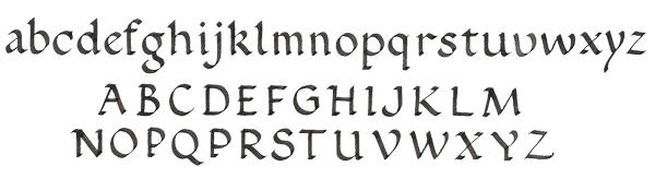
I was excited about starting the Palmer Method of Business Writing, but it appears it focuses esclusively on cursive handwriting. As such, I decided to pick up a book titled Fix it Write, which includes drills for improving print and/or cursive writing.

My youngest child is 14, and they didn't even teach him cursive in public grade school. His sister is two years older, and they did teach it back in third grade; however, she reports she never uses it in school.

I initially plan to focus on my printing since that is my primary form of writing. I don't even think I could make all the cursive characters after not using it since gradeschool some 30+ years ago.

Do y'all see value in improving only one style of writing, or eventually working on both? I figured it would be too much to try to improve both at the same time.
 

nortac

"Can't Raise an Eyebrow"
I suppose that if your printing is illegible and that's the way you write mostly, then yes you should try to improve it, particularly if others have to read it. However, I would think it would be easier, or at least more efficient to concentrate on one method at a time. One of the ways to improve any style of writing is to just slow down and make the letters properly. I would think that learning cursive properly might translate to improved printing by getting used to taking the effort to form letters properly, but that is purely supposition on my part. You know how to print, you just rush things and scribble. Learn to slow down by relearning cursive. As with any motor skill, starting slow to ingrain the the proper technique will later result in improved speed and efficiency (legibility). JMHO,YMMV,etc.
 
I for the life of me can't consistently write in cursive anymore. It comes out as some sort of hybrid mix...but, I can at least read it!
 

Attachments

  • $uploadfromtaptalk1421839475909.jpg
    $uploadfromtaptalk1421839475909.jpg
    29.6 KB · Views: 350
I teach cursive writing to my middle schoolers. Check out Getty-Dubay. Google it and you'll get there. Its easy to learn and its easy to personalize as you move along. If you like to mix cursive and print writing this is a great way to go. You'll understand why when you check it out.
 
I would think cursive needs more time practicing as most folks can print, fairly, legible, and that practicing the former would result in better the latter.
Good luck to you! :001_smile
 
I had/have a hybrid style, that is predominantly cursive. When I started writing pen pals regularly, and writing in a journal and trying to write more in cursive my cursive improved. Of course, I had a base. I still fall into the hybrid once in a while though.

Certain letters - especially certain capitals, I have a hard time with. The ones that are more like the printed version than all the curly cue stuff? H, K, O, P, Q, R, S, U... So 19 of 26 are basic cursive letter forms. The others are either a hybrid (S, U, K) or just straight block print (the remainder of the above). If I really wanted to and sat down and spent time I could probably make a lovely capital cursive S. The Q that looks like a 2? Just weird.
 
I love this thread .....I have a pretty easy way to kinda fast track your learning and others consistency. About a year ago I taught my self Chancery Italic followed by some half witted calligraphy in the Spencerian method (not copperplate).....now what I am getting at here is actually the type of paper ! they make a paper called seyes paper which is used extensively in Europe, and originated in France. I use Clairfontaine paper, but any Seyes will do. What this paper is; is a ruled and graphed type of paper and it helps your uniformity to develop muscle memory in your hand and arm ( never write from your wrist ). A small square for example should fit one lower case either print or, cursive letter. Use up to 2 lines on your lower case or, miniscule letters, as some like a "j" has a dropped down hook as well as a dot....... majuscule or upper case can use 3-4 lines, and each letter is almost always on square grid. This is important to developing good handwriting as this forces you to be consistent. Hope that helps a little a write on !
 
This is regularly ruled paper where I was practicing without Seyes lines to try and keep both Majuscule an Minuscule letter at an even height width....The writing itself still needs improvement, Like the actual lines, but IMHO from where I started, until August when I took this photo there is a HUGE improvement ( I started using seyes paper in late June 2014 maybe July ) as the letters are even in height and width, as well as I repeated a few that I felt where "off". I just wanted to show an example of NON Seyes paper, but how it improves consistency.

$690.jpg
 
I love this thread .....I have a pretty easy way to kinda fast track your learning and others consistency.

I use Clairfontaine paper, but any Seyes will do.

Thanks for the tip! I'm just starting out with a lined Rhodia notebook.

I found this BIN offering on eBay for Clairefontaine A5 Sayes. Is this the type of paper you are talking about (there is a picture of the paper in the details)? Where do you get your paper?
 
Thanks for the tip! I'm just starting out with a lined Rhodia notebook.

I found this BIN offering on eBay for Clairefontaine A5 Sayes. Is this the type of paper you are talking about (there is a picture of the paper in the details)? Where do you get your paper?
If it says "French-ruled" it means Seyes paper, so that's it, yes. There are several places to get it online, but Goulet Pens sells it that I know of.
 
I favor using a mix of cursive and printing. I think most adults write in a mix.

Some letters are much easier to legibly connect than others and connecting everything seems to bring no benefits. See Kate Gladstone.

I completely agree that the cursive forms of many capital letters are silly and not designed to improve legibility. Capital Qs are a perfect example.
 
Since I've retired, I've started working on my penmanship. I had three hurdles. First, I write left-handed, and normal cursive training and manuals are a conspiracy against left-handers. They made my father switch hands, and in my generation they would have done so had they been allowed.

Second, my hands have stiffened over the decades of extensive computer and mouse use (I was a programmer) and just plain hard work and abuse otherwise. The only cure for that was to begin writing. I started keeping a journal, and developed an interest in fountain pens and their inks. If I can't think of anything else to write about, I can always comment on how a particular pen or ink is working.

Third, I was always a sloppy writer. What I have done is to identify the character that I do worst, and then concentrate on forming it correctly. One letter at a time. I'm down to two lower-case characters -- the "r" and the "s". If I think about them, I can form them correctly, but that is not quite automatic -- yet. After that, I start on the upper-case characters.

I'm working on this font or something similar:
$benediktgrondal-copperplate.gif
 
I never use the cursive capital Q, ever. It looks ridiculous. I go back and forth on the capital A and the capital G. The capital H is always a hybrid of print and cursive. And my capital T and F are the way my mom taught me, not the way they're "supposed" to look.
 
I never use the cursive capital Q, ever. It looks ridiculous. I go back and forth on the capital A and the capital G. The capital H is always a hybrid of print and cursive. And my capital T and F are the way my mom taught me, not the way they're "supposed" to look.

Same. I loathe the way the capital Q looks in the style of cursive that I learned. It looks like an idiotic 2. I've recently relearned how to do capital A, G, and Z in different styles because I've never clicked with the stuff I learned. I've pretty much thrown out the stuff I don't click with and looked up different styles that I find more visually pleasing, so my cursive letters have picked up a mix of different styles mixed with some personalizations. I still can't figure out a decent capital I. All of mine look awful and out of place with the rest of my letters. I've also been working to add some embellishments to make the letters more "pretty", rather than sharp. All of my print comes from years of drafting classes in school. They're clean and neat, but getting graded on lettering daily for a few years will tend to pound those lessons into your brain and hand.
 
I've been following the Fix it Write book, and I don't really care for the italic print the guide promotes. If I'm going to go to the effort of printing and connecting characters together, I might as well write in cursive.

Since I would rather work on my printing for now, I decided to break out on my own with a Clairefontaine french-lined notebook that Aschecte recommended. I like how it helps keep your letters the same size. I did some warm-up exercises, and decided to just work on the alphabet in the book.

Is it realistic to print using a Round Font like below, or is that really just for calligraphy work with all the thin/thick parts of the characters? I'm not worried about speed (i.e., I'm not taking notes in a class), I would just really like to print in a legible, and somewhat fancy manner.
proxy.php
 
I did some more research, and it looks like the font I posted is more for calligraphy given all the thin and thick lines.

I'm guessing I will need to find a simpler font with less flourish for everyday writing.
 
I did some more research, and it looks like the font I posted is more for calligraphy given all the thin and thick lines.

I'm guessing I will need to find a simpler font with less flourish for everyday writing.

I started trying the Palmer method earlier this month, but I didn't like how plain Jane the script was. Plus I didn't get the point of the exercises really. After looking around a bit, I came across the Spencerian method which uses a bit more of a elegant script. The theory book and 5 practice books can be had from Amazon for under $20.
So far I like it better and my writing has improved. SWMBO saw my writing and mentioned "That doesn't look like your writing. That looks nice!" :lol:

Here's sample of the Spencerian script taken from another fountain pen website done by Ken F:

$Handwritingmodified600.jpg
 
As Kevan said yes that is French ruled or, Seyes paper. I actually am lucky enough to have a few pen and stationary shops locally about 2 miles down the road from my house and they have an insane amount of paper brands including discontinued historical to the modern Rhodia or, Clairefontaine paper mentioned above......also I saw Brian Goulet and Goulet pens mentioned. If you have never visited the Goulet website you really have to he is not the cheapest I've found, but he has resources and comparison charts as well as interactive tools ! this is an amazing website.

Thanks for the tip! I'm just starting out with a lined Rhodia notebook.

I found this BIN offering on eBay for Clairefontaine A5 Sayes. Is this the type of paper you are talking about (there is a picture of the paper in the details)? Where do you get your paper?
 
I picked up three of the A5 Clairefontaine French-ruled notebooks from Goulet pens. It is helpful in consistently forming my characters as I practice. I found elements of a lower case font I am trying to emulate. It is from Alfred Fairbanks' A Handwriting Manual. I ordered a paperback copy from Amazon, which is still in transit.

I am finding my Lamy Safari with Medium NIB just cannot make the thin/think line variations shown in the font, so I'm kind of adapting as best as I can. I have thought about a different type of pen/NIB, but not sure I want to go down the calligraphy path.

$Alfred Fairbanks - a handwriting manual - example italic-printing.jpg
 
One does not really need to go down the calligraphy path to use an italic nib and get some thick/thin line variation. (Spencerian actually calls for a flex nib for its line variation.) I generally use an italic nib. I think using one will help in handwriting practice--for one thing it helps one see letter formations more clearly--regardless of what one uses to write with day to day.
 
Top Bottom