What's new

Please Critique

Good morning guys! I'm just starting to mess around in Light Room and would love for some feedback on what I have been doing. These were all shot last year on the coast of California.

The first one I'm pretty happy with in general.

full

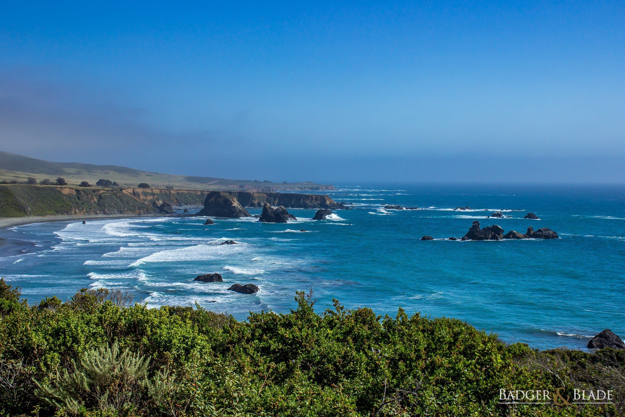
1/400, ISO 100, 34mm, f/8.0

The second one, I know I should have used a faster shutter speed to get the birds in focus, but at the time it looked good in the LCD. I'm pretty happy about how it turned out, cropped it down to give a better focus, took out most of the water b/t me and the rocks. The wife thinks that section of water in the foreground looks over processed.

full

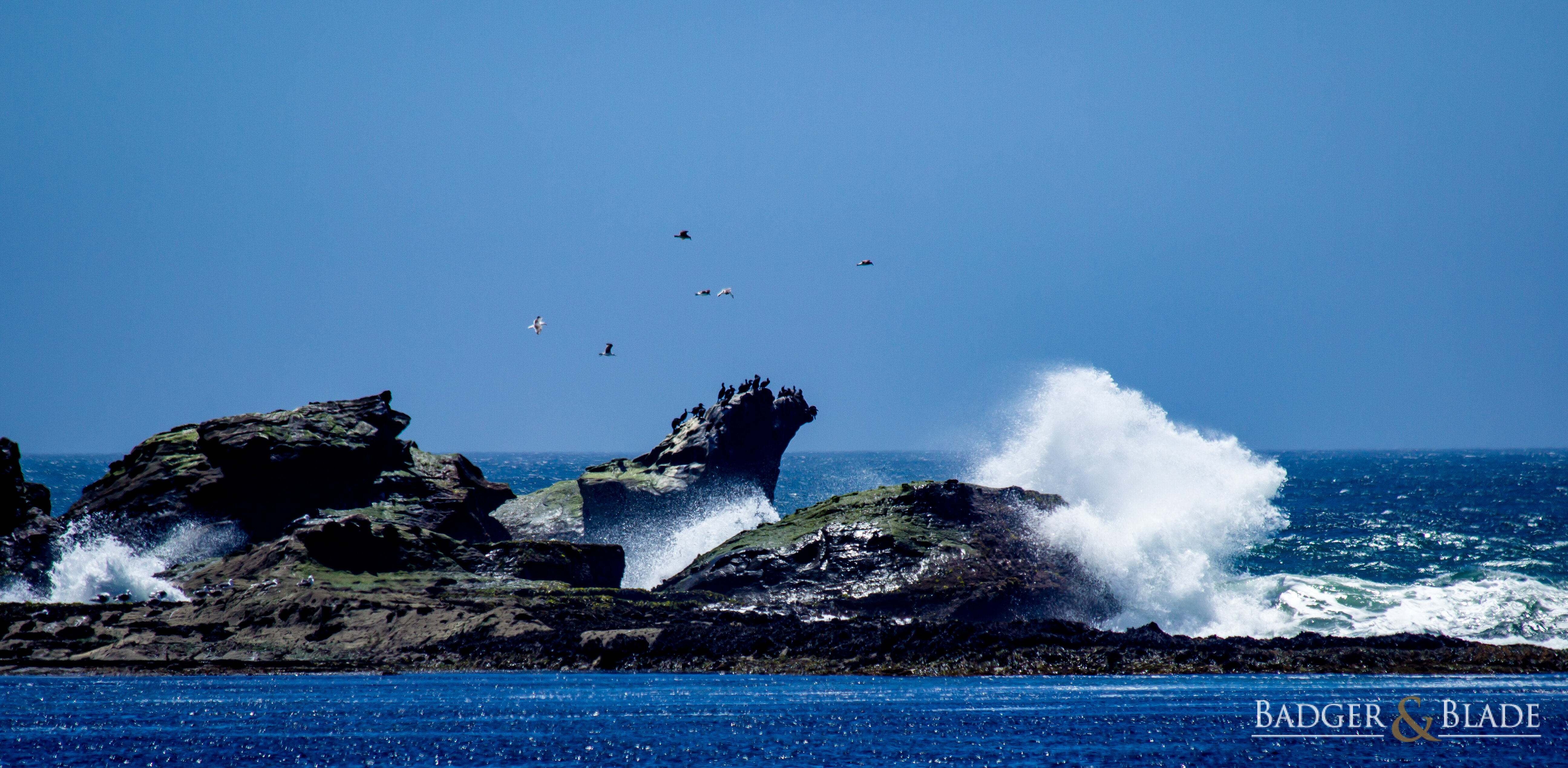
1/640, ISO 100, 300mm, f/6.3

Last, I'm not sure what to do with this one, I really want to bring out some of the clouds on the left but in doing so it's really making the rest of the picture look too dark. I have selected a graduated filter, brought the exposure down slightly, then bumped up the shadows to try to get some of the detail in the mountains back. This also caused my sky to be too dark I think. But without these, the clouds are way too blown out and don't look right with the rest of the picture.

full

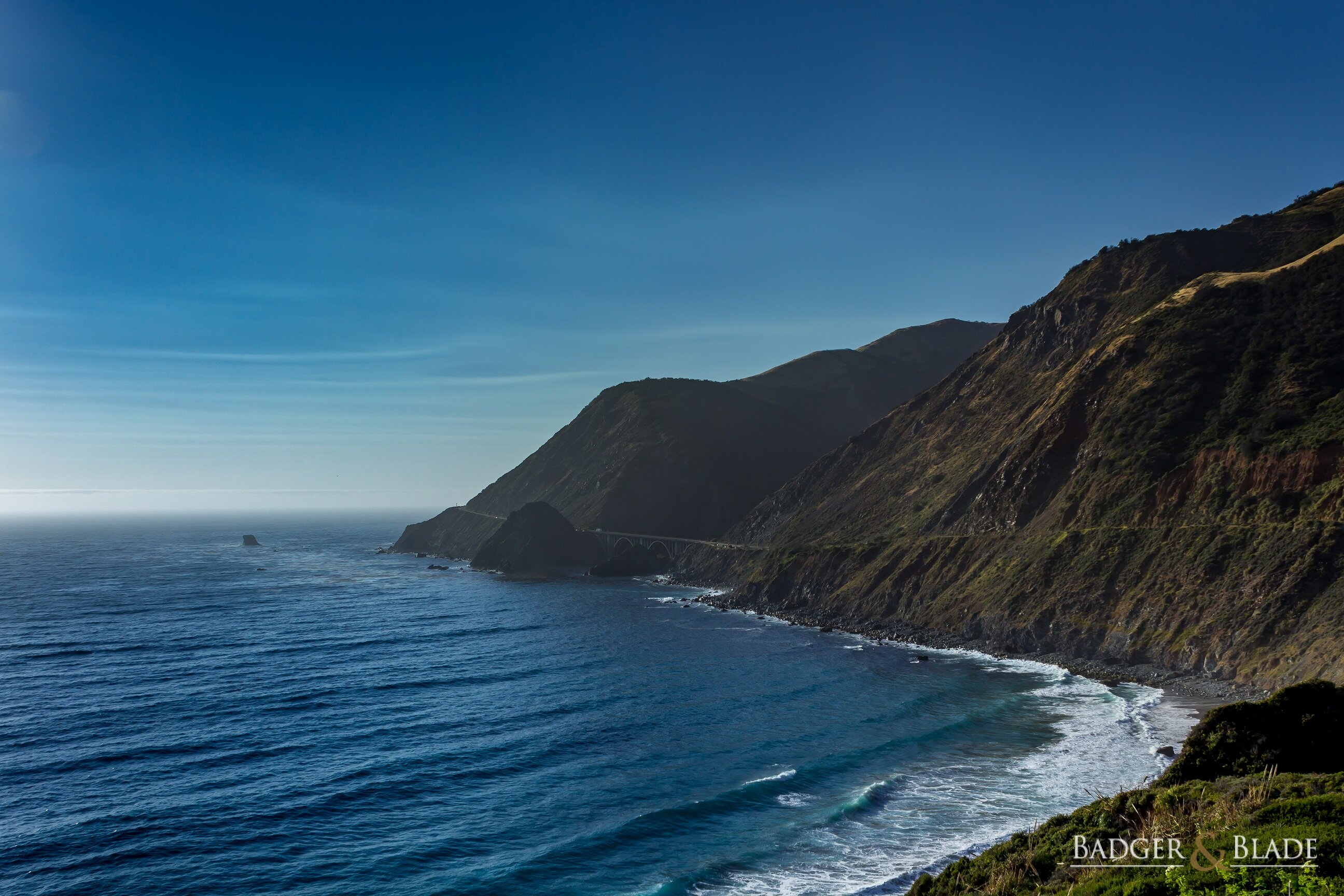
1/500, ISO 100, 23mm, f/8.0
 
I don't have anything useful as far as image editing but the scenery is beautiful, especially the center shot. Very sharp and contrasty to my eye.

What type of camera were these taken with?
 
Thanks guys, these were taken near Big Sur with a Canon T4i and the 18-55 and the middle was a 70-300.


Sent from my iPhone using Tapatalk
 
I really like the first one, the green in the bottom of the photo gives a very nice contrast to all the blue.

The middle one looks like it have had quite a bit of sharpness and/or contrast added, it appears a bit harsh to me, but maybe it is because of the cropping?

The last one is like you mention yourself.
If you would like to make more area specific changes I can really recommend Google's Nik Collection.
It works as an add-on in Photoshop and Elements (don't know about Lightroom) but it can also work as a standalone program.
I use it frequently and it can help you bring out the clouds in the last photo as you mention.
 

Billski

Here I am, 1st again.
I spent time looking at the 3 pictures and couldn't make up my mind perfectly.

The dark sky in Number 3 looks better to me.
 
I like #1 as-is. #2, as mentioned, the near water looks overly sharp/processed, more like a lapis stone. #3, I am drawn to the curve of the shoreline, and wonder about LESS on the left side--crop closer to the mountainous shoreline to highlight that glorious curve... I'm an amateur photographer and all opinions are my own :) Great shots!
 
@shm Thank you for your comments, I too really like the first one, I'll play with the middle one a bit more this weekend and see what I can manage, I might start from scratch again.

@Billski Thank you sir.

@TrimBeard I really dig the idea you have for the third image and I might crop that one down. When I was shooting it, I really was focused on capturing the bridge, everything else was just a happy coincidence.
 
#2 I am ok with, yes a faster speed would have sharpened the birds, but I think that would have lost some of the break effect of the wave. As for the processing, it looks like its almost on par with the background water. Maybe softening it a bit would help.

#3 If the focus was truly the bridge I would process it to make that more of a focus and use the movement of the road and shoreline as your focus for the processing. The contrast of the cloud it nice but it's not what draws the eye.
 
I like all three shots. They are all nicely composed and very attractive landscapes. But, if you want to edit them I'd make some suggestions.

Picture 1: On the left side, above the horizon, the cloud is coming out more grey than white, and it is the one dull spot in the photo. Maybe you can lighten it (not sure what software you are using). It that doesn't work, try going monochrome and see what happens.

Picture 2: I wouldn't worry about the sharpness of the birds. They are so small in the image that it is difficult to notice that. I'd desaturate the whole image a bit. It is a very brilliant blue. If necessary, give the water in the foreground a bit of extra desaturation. It is very blue!

Picture 3: Very good shot overall. You might try a dehaze tool and see if that does anything for it. The only thing I would definitely do is to give it a slight straightening. If you look at the horizon over the water, even though because of the weather the horizon isn't crisp, you can see it rises up very slightly from the left side of the photo to the center.

I hope that helps!
 
Top Bottom